Process
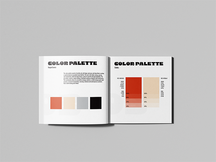
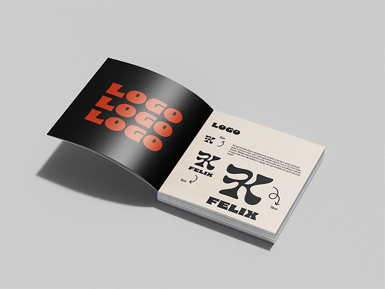
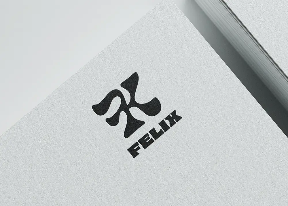
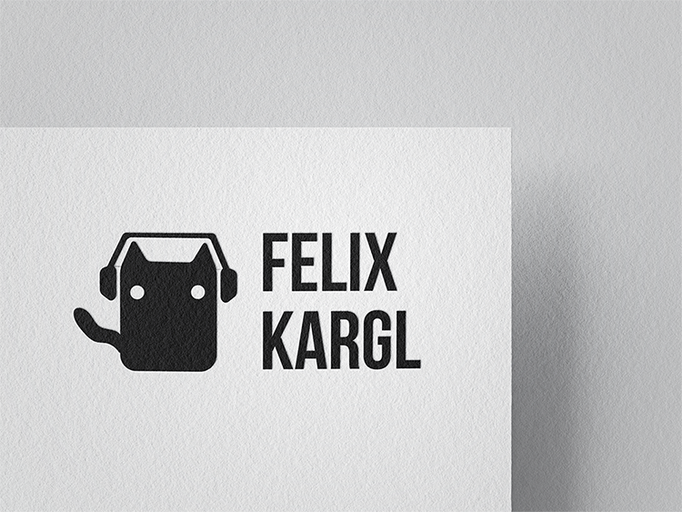
The goal was to create a consistent and versatile brand identity for Felix Kargl that reflects his core values of clarity, functionality, and unique aesthetics. The process began with defining target audiences and brand values as the strategic foundation. A flexible logo system with multiple variations was developed, complemented by organic, flowing elements as a distinctive visual feature. The color palette and typography were chosen to balance digital precision with creative sophistication. Using moodboards, stylescapes, and mockups, the visual language was refined step by step, maintaining a balance between minimalism and character.Some of the logos made in the process:
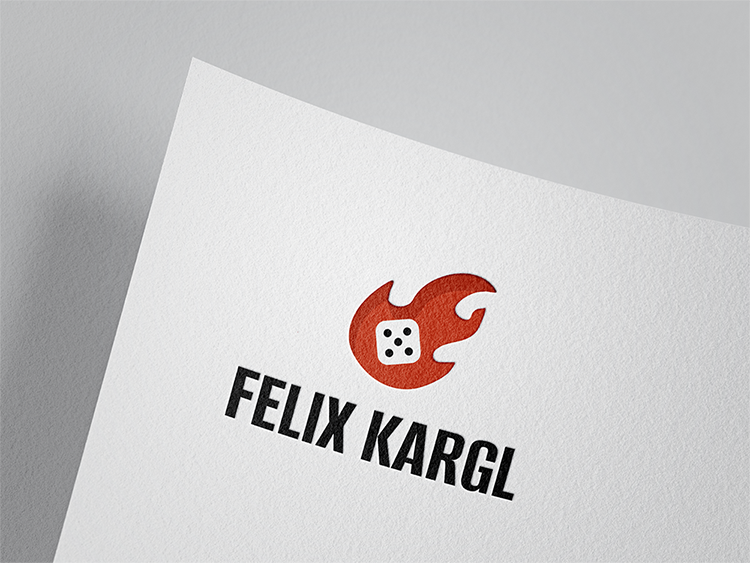


Result
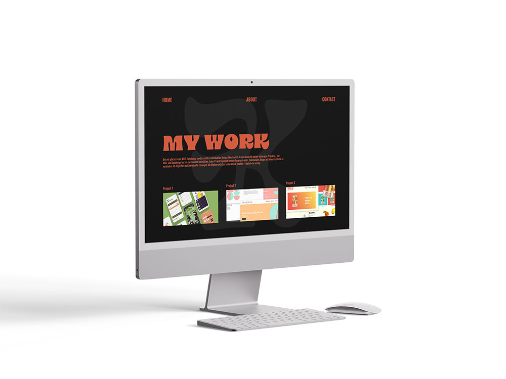
The outcome is a modern and adaptable branding system that works across print, web and digital applications. The logo, usable as both a wordmark and a symbol, forms the visual core, supported by a harmonious color palette of warm red, beige, gray and black, paired with striking typography. The brand book consolidates all guidelines for consistent application and serves as a reference for future design work. The minimalist web design provides an elegant stage for showcasing Felix’s work, while flowing elements add movement and recognition value. In print, the brand comes to life through clean, bold business cards that translate the digital aesthetic into a tactile experience. Overall, the identity reflects Felix Kargl’s personality and offers a strong identity for professional and visually compelling communication of his game development brand.