Process
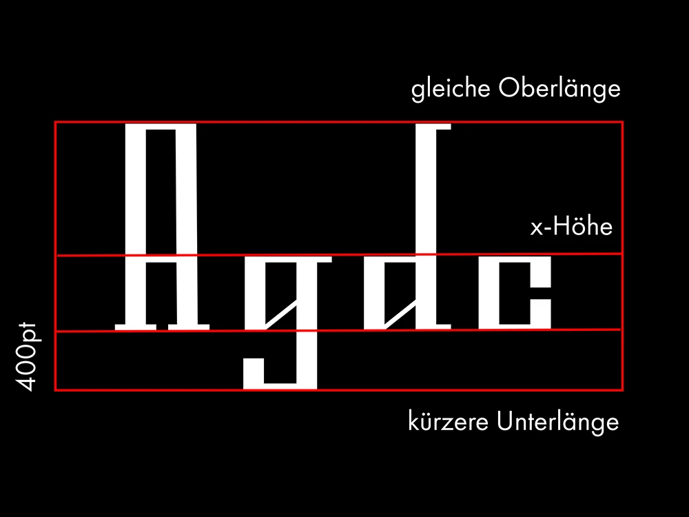
The development of these typefaces began with extensive research into historical and natural inspirations. For Omaja, I studied traditional Slavic Cyrillic fonts and translated their unique features into a modern Latin design. Nesrin, on the other hand, drew inspiration from organic forms in nature, like the wild rose, balancing sharp and rounded shapes. Every letter in both fonts was carefully hand-drawn, allowing me to explore curves, details, and proportions that give each typeface a distinct personality while maintaining readability. This hands-on process ensured that both fonts carry emotion and character, whether historical, decorative, or natural.

Result
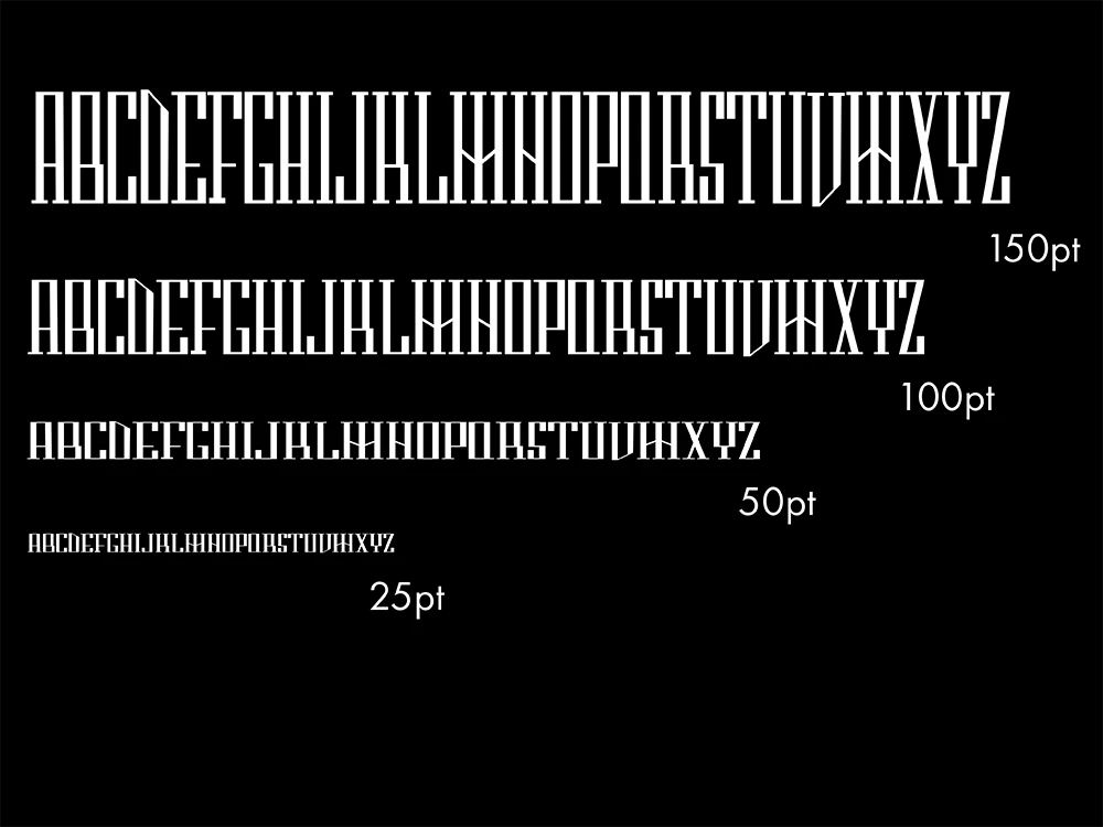
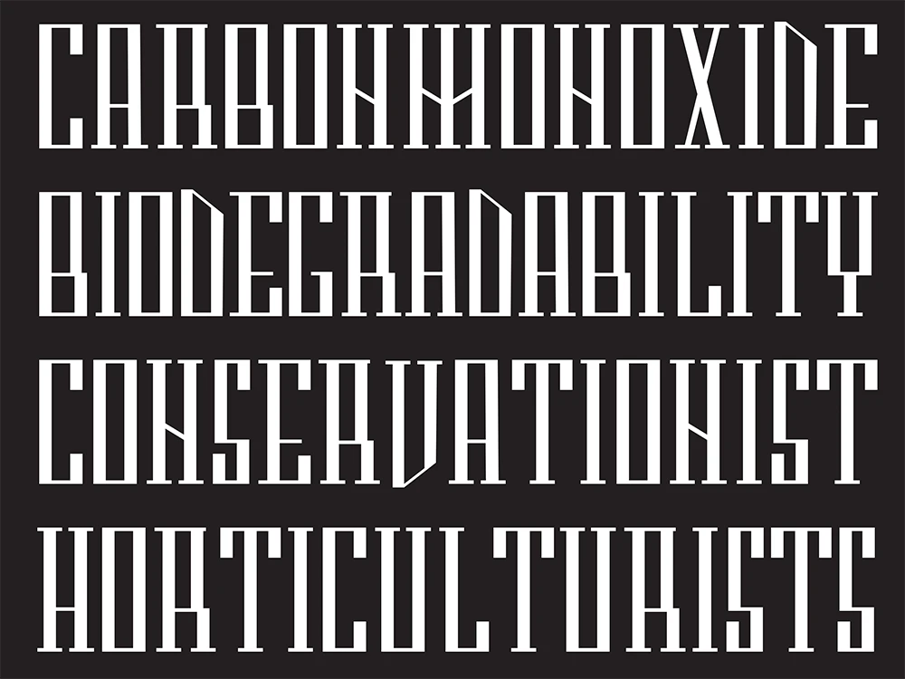
The final typefaces, Omaja and Nesrin, combine tradition, nature, and modern design into decorative, expressive fonts. Both have distinct personalities that give text a unique feel: Omaja blends Slavic heritage with contemporary Latin forms, while Nesrin reflects organic elegance and subtle imperfection. Designed in multiple weights, they work as eye-catching fonts for branding, editorial, or decorative use, offering a balance between readability, personality, and aesthetic appeal.